
Recommended in this issue is a Neumorphism-style flutter component library called F-Widget.

F-Widget is an open source Flutter component library by the Flying Pig team. It contains buttons, search boxes, logos, toasty, switches and many other high-texture, quasi-object style components.
class=”pgc-h-arrow-right”>
- Rich corner effect
- Beautiful border decoration
- Flexible icon support
- Cool interactive effects
- More spatial shadows
- High texture Neumorphism style
FButton Use example
FButton supports rounded corners, borders, ICONS, effects, Loading mode, and Neumorphism style with high texture.

Basic use:
You can construct a working FButton by simply configuring text and onPressed.
If onPressed is not set, FButton is automatically recognized as not unavailable. In this case, the FButton will have a default unavailable state style.
You are also free to configure the style of the FButton unavailable state via the disabledXXX property.

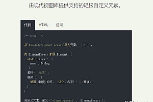
// FButton #1
FButton(
  height: 40,
  alignment: Alignment.center,
  text: "FButton #1",
  style: TextStyle(color: Colors.white),
  color: Color(0xffffab91),
  onPressed: () {},
)

// FButton #2
FButton(
  padding: const EdgeInsets.fromLTRB(12, 8, 12, 8),
  text: "FButton #2",
  style: TextStyle(color: Colors.white),
  color: Color(0xffffab91),
  corner: FCorner.all(6.0),
)

// FButton #3
FButton(
  padding: const EdgeInsets.fromLTRB(12, 8, 12, 8),
  text: "FButton #3",
  style: TextStyle(color: Colors.white),
  disableStyle: TextStyle(color: Colors.black38),
  color: Color(0xffF8AD36),

  /// Configure unavailable colors
  disabledColor: Colors.grey[300],
  corner: FCorner.all(6.0),
)
Neumorphism Style:
FButton For developers to bring incredible, ultra-high texture Neumorphism style.
Developers can turn on and off the Neumorphism style simply by configuring the isSupportNeumorphism parameter.
If you want to adjust the style of Neumorphism, you can make subtle adjustments through several properties related to Shadow, including:
- shadowColor: Configure dark shadow
- highlightShadowColor: Configure the light shadow
FButton also provides the lightOrientation parameter, which even allows the developer to adjust the caret Angle, Different Neumorphism effects have been obtained.

FButton(

  /// Enable Neumorphism support  Objective
  ///
  /// Turn on Neumorphism support
  isSupportNeumorphism: true,

  /// Configuring the direction of light source
  ///
  /// Configure light source direction
  lightOrientation: lightOrientation,

  /// Configuring a light shadow
  ///
  /// Configure highlight shadow
  highlightShadowColor: Colors.white,

  /// Configuring dark shadow
  ///
  /// Configure dark shadows
  shadowColor: mainShadowColor,
  strokeColor: mainBackgroundColor,
  strokeWidth: 3.0,
  width: 190,
  height: 60,
  text: "FWidget",
  style: TextStyle(
      color: mainTextTitleColor, fontSize: neumorphismSize_2_2),
  alignment: Alignment.center,
  color: mainBackgroundColor,
  ...
)
class=”pgc-h-arrow-right” data-track=”116″>FSearch
FSearch supports borders, corners, gradient background colors, and shadows, as well as any number of prefix and suffix action buttons. Provides a nice Hint animation.

Basic use:
With a few simple parameters, developers can easily change the size, color, and font of the search bar.
When the user clicks search Action on the keyboard, onSearch is triggered, allowing the developer to perform some search operations here.

FSearch(
  height: 30.0,
  backgroundColor: mainBackgroundColor,
  style: style,

  /// Prefix Widget
  ///
  /// prefix widget
  prefixes: [ buildAction() ],

  /// Suffix Widget
  ///
  /// suffix widget
  suffixes: [
    buildAction_1(),
    buildAction_2(),
    buildAction_3(),
  ],
  onSearch: _onSearch,
)
class=”pgc-h-arrow-right” data-track=”141″>FSwitch
FSwitch supports setting prompts, slider decorations, shadows, and good interaction effects.

Basic use:
FSwitch You always need to set onChanged to respond to the switch state.

FSwitch(
  onChanged: (v) {},
)
available status & Shadow:
enable to change the available state of FSwitch . Once FSwitch becomes available, the switch state cannot be changed again. In addition, the FSwitch provides flexible and convenient shadow configuration support.

FSwitch(
  onChanged: (bool value) {
    value_1 = value;
  },
  open: value_1,
  enable: enable_1,
  shadowColor: Colors.black.withOpacity(0.5),
  shadowBlur: 3.0,
),
class=”pgc-h-arrow-right”>

—END—
Open source protocol: Apache2.0


