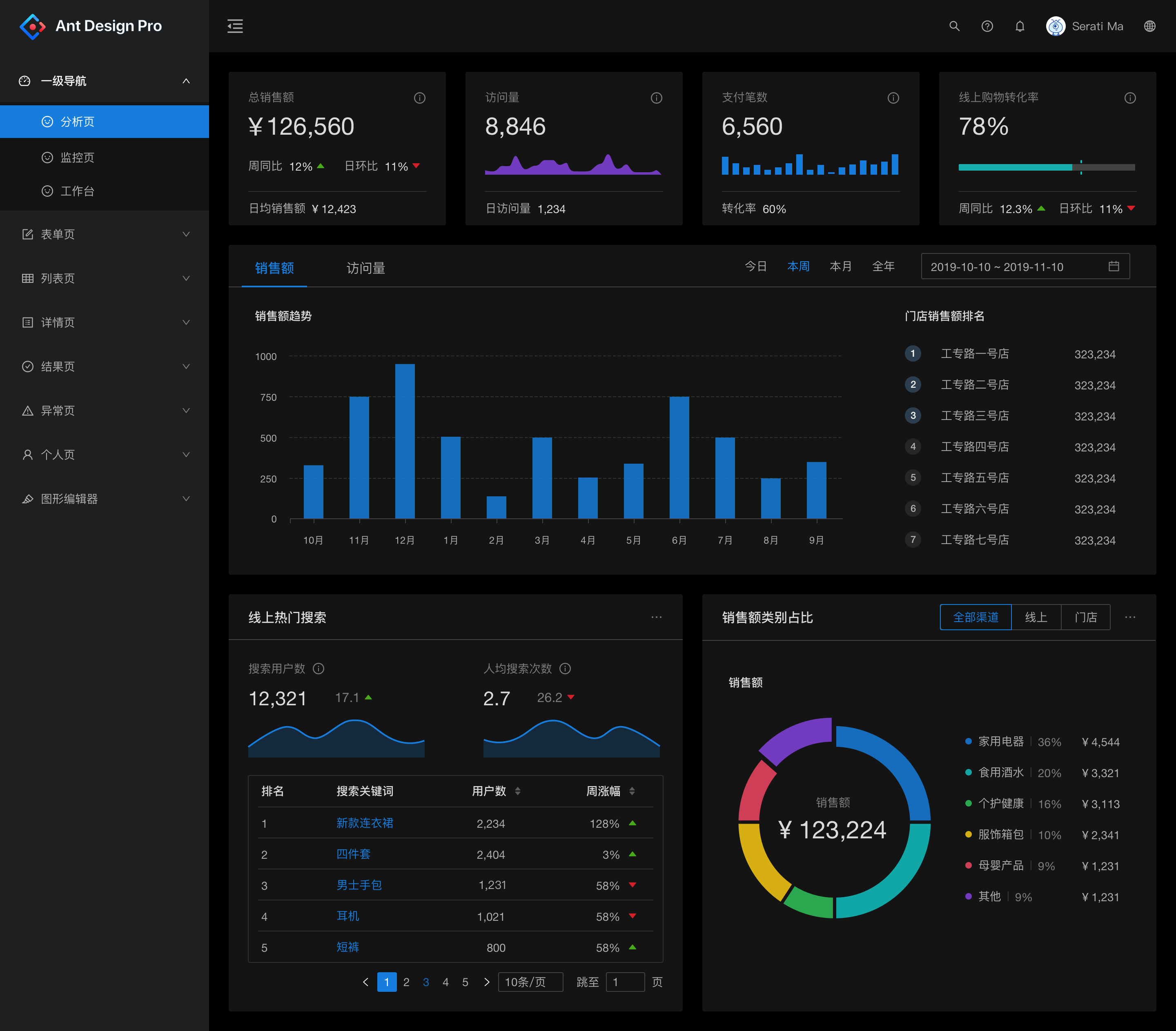
The antd recommended in this issue is a React UI component library based on the Ant Design design system, which is mainly used for the development of enterprise-level middle and back-office products.

characteristic
Extracted from the interactive language and visual style of enterprise-level middle and back office products.
High-quality React components out of the box.
Developed using TypeScript, a complete type definition file is provided.
Full-link development and design tool system.
Dozens of international languages are supported.
Customization of the theme in every detail is possible.
Installation
Install using npm or yarn
$ npm install antd –save
$ yarn add antd
Browser introduce
Ingest files directly in the browser using script and link tags, and use the global variable antd.
We provide antd.js antd.css and antd.min.js antd.min.css in the antd/dist directory in the npm distribution.
Example:
import { DatePicker } from ‘antd’;
ReactDOM.render(<DatePicker />, mountNode);
Introducing Styles:
import ‘antd/dist/antd.css’; // or ‘antd/dist/antd.less’
Get started quickly
The first example
This is an online codesandbox demo of the simplest Ant Design component.

1. Create a codesandbox
visit
http://u.ant.design/codesandbox-repro Create an online example of CodeSandbox and don’t forget to save it to create a new instance.
2. Use components
Replace the contents of index.js directly with the following code, and use the antd component directly in React.
import React, { useState } from ‘react’;
import { render } from ‘react-dom’;
import { ConfigProvider, DatePicker, message } from ‘antd’;
Since the default text of the antd component is English, it needs to be modified to Chinese
import zhCN from ‘antd/lib/locale/zh_CN’;
import moment from ‘moment’;
import ‘moment/locale/zh-cn’;
import ‘antd/dist/antd.css’;
import ‘./index.css’;
moment.locale(‘zh-cn’);
const App = () => {
const [date, setDate] = useState(null);
const handleChange = value => {
message.info(‘The date you selected is: ${value ? value.format(‘YYYYY MM month DD day’) : ‘not selected’}’);
setDate(value);
};
return (
<ConfigProvider locale={zhCN}>
<div style={{ width: 400, margin: ‘100px auto’ }}>
<DatePicker onChange={handleChange} />
<div style={{ marginTop: 16 }}>
Current Date: {date ? date.format(‘YYYYY-mm-dd-day’): ‘Not selected’}
</div>
</div>
</ConfigProvider>
);
};
render(<App />, document.getElementById(‘root’));
Customize the theme
Ant Design design specifications and technology support flexible style customization to meet the diverse visual needs of business and brand, including but not limited to global styles (main colors, rounded corners, borders) and visual customization of specified components.

Style variables for Ant Design
Here are some of the most commonly used generic variables, all of which can be found here.
@primary-color: #1890ff; Global dominant color
@link-color: #1890ff; Link color
@success-color: #52c41a; Success color
@warning-color: #faad14; Warning color
@error-color: #f5222d; Wrong color
@font-size-base: 14px; Main font size
@heading-color: rgba(0, 0, 0, 0.85); Title color
@text-color: rgba(0, 0, 0, 0.65); Primary text color
@text-color-secondary: rgba(0, 0, 0, 0.45); Secondary text color
@disabled-color: rgba(0, 0, 0, 0.25); Invalid color
@border-radius-base: 2px; Component/float fillet
@border-color-base: #d9d9d9; Border color
@box-shadow-base: 0 3px 6px -4px rgba(0, 0, 0, 0.12), 0 6px 16px 0 rgba(0, 0, 0, 0.08),
0 9px 28px 8px rgba(0, 0, 0, 0.05); Floating shadows
Official theme
