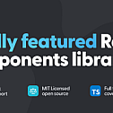
In this issue, we recommend a TypeScript-based React component library with native dark theme support – mantine.

Mantine is a React component library with over 120 customizable components and hooks, including basic inputs, buttons, patterns, popovers, typography elements, layout management, and more. The best feature of Mantine is that all components support a dark theme out of the box, which can be applied to the program with just a few lines of code.
Features
Collect more than 30 hooks for state and UI management
With more than 100 Mantine core components
Full-featured notification system
Code highlighted using prism-react-renderer
Quill-based rich text editor
Manage files by dragging and dropping them into an area or the entire screen
Centralized modal manager
Server-side rendering utility
Next.js’s server-side rendering utility
The Gatsby plugin sets up server-side rendering
ESLint and Prettier configurations used in all Mantine projects
Examples of components and functions
Core Component Library: The Mantine Core Library includes all the basic components: inputs, buttons, patterns, popovers, typography elements, layout management, and more

- Theming: Extend the default theme with any number of additional colors, replacing shadows, radius, spacing, fonts, and many other attributes to match your design requirements
import { Badge, Button, MantineProvider } from ‘@mantine/core’;function Demo() {
return (
<MantineProvider theme={{
fontFamily: ‘Greycliff CF, sans-serif’,
colors: {
‘ocean-blue’: [‘#7AD1DD’, ‘#5FCCDB’, ‘#44CADC’, ‘#2AC9DE’, ‘#1AC2D9’, ‘#11B7CD’, ‘#09ADC3’, ‘#0E99AC’, ‘#128797’, ‘#147885’],
‘bright-pink’: [‘#F0BBDD’, ‘#ED9BCF’, ‘#EC7CC3’, ‘#ED5DB8’, ‘#F13EAF’, ‘#F71FA7’, ‘#FF00A1’, ‘#E00890’, ‘#C50E82’, ‘#AD1374’],
},
}}>
<Button color=”ocean-blue”>Ocean blue button</Button>
<Badge color=”bright-pink” variant=”filled”>Bright pink badge</Badge>
</MantineProvider>
);
}
Dark theme: Add a dark theme to your app with just a few lines of code – Mantine exports global styles for light and dark themes, and all components support dark themes out of the box

- Hooks Library: Mantine comes with more than 30 hooks to manage state and UI to help you build custom components. All the hooks used to build Mantine components are exported from the @mantine/hooks package, hooks don’t depend on the component package, you can use them independently in any React application.
Lock scroll hook:
import { useScrollLock } from ‘@mantine/hooks’;
import { Button } from ‘@mantine/core’;function Demo() {
const [scrollLocked, setScrollLocked] = useScrollLock();
const label = scrollLocked ? ‘Unlock scroll’ : ‘Lock scroll’;
return <Button onClick={() => setScrollLocked((c) => !c)}>{label}</Button>;
}
API Transitions: Use pre-made transition animations or build your own with a simple API, all Mantine components support custom transition animations
Pre-made animations:

Custom Animations:
const scaleY = {
in: { opacity: 1, transform: ‘scaleY(1)’ },
out: { opacity: 0, transform: ‘scaleY(0)’ },
common: { transformOrigin: ‘top’ },
transitionProperty: ‘transform, opacity’,
};
<Modal transition={scaleY} transitionDuration={300}>
<AuthenticationForm />
</Modal>
Notification system: A full-featured notification system integrates seamlessly with your Mantine theme

- Rich Text Editor: A Quill.js-based rich text editor that handles image uploads, supports embedding videos, and integrates seamlessly with the Mantine theme

- Custom styles: Each Mantine component supports overriding the style of each internal element inside with classes or inline styles
Default slider style:
<Slider defaultValue={40} marks={marks} />

After adding additional styles:
<Slider
  defaultValue={40}
  marks={marks}
  labelTransition="fade"
  size={2}
  styles={(theme) => ({
    track: { '&::before': { backgroundColor: theme.colorScheme === 'dark' ? theme.colors.dark[3] : theme.colors.blue[1] } },
    mark: { width: 6, height: 6, borderRadius: 6, transform: 'translateX(-3px) translateY(-2px)', borderColor: theme.colorScheme === 'dark' ? theme.colors.dark[3] : theme.colors.blue[1] },
    markFilled: { borderColor: theme.colors.blue[6] },
    markLabel: { fontSize: theme.fontSizes.xs, marginBottom: 5, marginTop: 0 },
    thumb: { height: 16, width: 16, backgroundColor: theme.white, borderWidth: 1, boxShadow: theme.shadows.sm },
  })}
/>
This project uses the MIT open source license, and you can read more functions by yourself.


