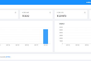
This issue recommends the Vue3.0 version of the classic front-end UI framework Layui – layui vue.

Layui is a front-end UI framework written according to its own module specifications. Its simple and lightweight style, as well as elegant and abundant components, have received unanimous praise from many back-end developers. With the popularity of ES6, React and Vue have experienced unprecedented development, leading to layui announcing the cessation of maintenance in October 2021. Now, layui has returned with Vue3.0 version, and the pop-up layer component layer and backend template layui admin also have corresponding Vue3.0 versions, and the icon componentization solution icons vue has been added.
Installation
Install using npm, yarn, pnpm
npm install @layui/layui-vue --save
or
yarn add @layui/layui-vue --save
Global registration
import App from './ App.vue'
import { createApp } from 'vue'
import Layui from '@layui/layui-vue'
import '@layui/layui-vue/lib/index.css'

createApp(App).use(Layui).mount('#app')
The above code completes the introduction of layui vue. It should be noted that the style file needs to be imported separately
Import on demand
import App from './ App.vue'
import { createApp } from 'vue'
import { LayButton,  LayTable } from '@layui/layui-vue'
import '@layui/layui-vue/es/button/index.css';
import '@layui/layui-vue/es/table/index.css';

var app = createApp(App).

app.component("LayButton", LayButton);
app.component("LayTable", LayTable);

app.mount('#app')
Basic Example
<< span class="hljs-name">lay-layout></ span>
<< span class="hljs-name">lay-header></ span>
<< span class="hljs-name">lay-logo></ span>Layui Admin</< span class="hljs-name">lay-logo></ span>
</< span class="hljs-name">lay-header></ span>
<< span class="hljs-name">lay-side></ span></< span class="hljs-name">lay-side></ span>
<< span class="hljs-name">lay-body></ span>
<< span class="hljs-name">router-view></ span></< span class="hljs-name">router-view></ span>
</< span class="hljs-name">lay-body></ span>
<< span class="hljs-name">lay-footer></ span>pearadmin.com</< span class="hljs-name">lay-footer></ span>
</< span class="hljs-name">lay-layout></ span>
Topic
Custom Theme
Layui supports a certain degree of theme customization to meet the diverse visual needs of business and brand, including but not limited to visual customization of main colors, rounded corners, borders, and some components
Here are some of the most commonly used generic variables, and all style variables can be found here
@global-primary-color: #009688; < Span class="hljs comment">//Theme color
@global-checked-color: #5FB878; < Span class="hljs comment">//Select color
@global-border-radius: 2px; < Span class="hljs comment">//Roundness degree In addition to global theme configuration, we also provide customized theme configuration for components, which will cover the global configuration
@button-primary-color: #009688; < Span class="hljs comment">//Button theme color
@button-border-radius: 2px; < Span class="hljs comment">//Button fillet degree
...Customization method
Create a separate ‘less’ variable file and import it to overwrite the variables in index. less
@import '@layui/layui-vue/lib/index.less'; < Span class="hljs comment">//Introduce the official provided less style entry file
@import 'your-theme-file.less'; < Span class="hljs comment">//Used to override the variables defined above
Note: Styles must be loaded in less format, and a common issue is the introduction of multiple styles where less styles are overwritten by CSS styles
Partial components
Color
Layui mainly uses the symbol of inclusiveness, dark green, as its main color tone. Due to its deep feeling, it is usually accompanied by light black, and blue, a more vivid color tone, is used to compensate for its color fatigue. Overall, it makes people feel fresh and natural, and more durable. The meaning of color selection: We are persistent in pragmatism, do not blindly compare ourselves, and always remember to bloom with vitality. This is exactly the value that Layui pursues

In fact, layui is not afraid to try some bright colors, but in many cases it may not be suitable. Therefore, we classify these colors as “scenery”, which means presenting corresponding colors according to the actual scene. For example, if you want to give people a sense of alertness, you can try using the red color above

Layui believes that gray represents minimalism because it is a magical color that can be paired with almost any element, is not prone to visual fatigue, and will never go out of style. Low profile yet elegant

Button
Minimalist button

Rounded corner button

Layout
Basic layout

Complex layout


Grid grid
Basic usage

Grid offset

Stream layout

For more content, you can read it on your own
Component documentation:
http://layui-vue.pearadmin.com/zh-CN/components/color


