The Storybook recommended in this issue is an open source tool for building UI components and pages individually. It simplifies UI development, testing, and documentation.

Storybook is a UI development tool. It makes development faster and easier by isolating components. This allows you to work on one component at a time. You can develop the entire UI without having to launch a complex development stack, force some data into the database, or navigate through the application.
Storybook helps you document components for reuse and automatically visually test components to prevent errors. Extend your Storybook with an ecosystem of plug-ins to help you do things like fine-tune responsive layouts or verify accessibility.
Installing Storybook
Install it in a single command using the Storybook CLI. Run it in the root directory of your existing project:
# Add Storybook:
npx sb init
Storybook will look at your project’s dependencies during the installation process and provide you with the best configuration available.
The above command will make the following changes to your local environment:
- Install the required dependencies.
- Sets the scripts needed to run and build the Storybook.
- Add the default Storybook configuration.
- Add some boilerplate stories to help you get started.
According to your framework, first, build your application, and then check that everything works by running it:
# Starts Storybook in development  mode
npm run storybook
It will start the Storybook locally and output the address. Depending on your system configuration, it will automatically open the address in a new browser TAB, and then you will see a welcome screen.
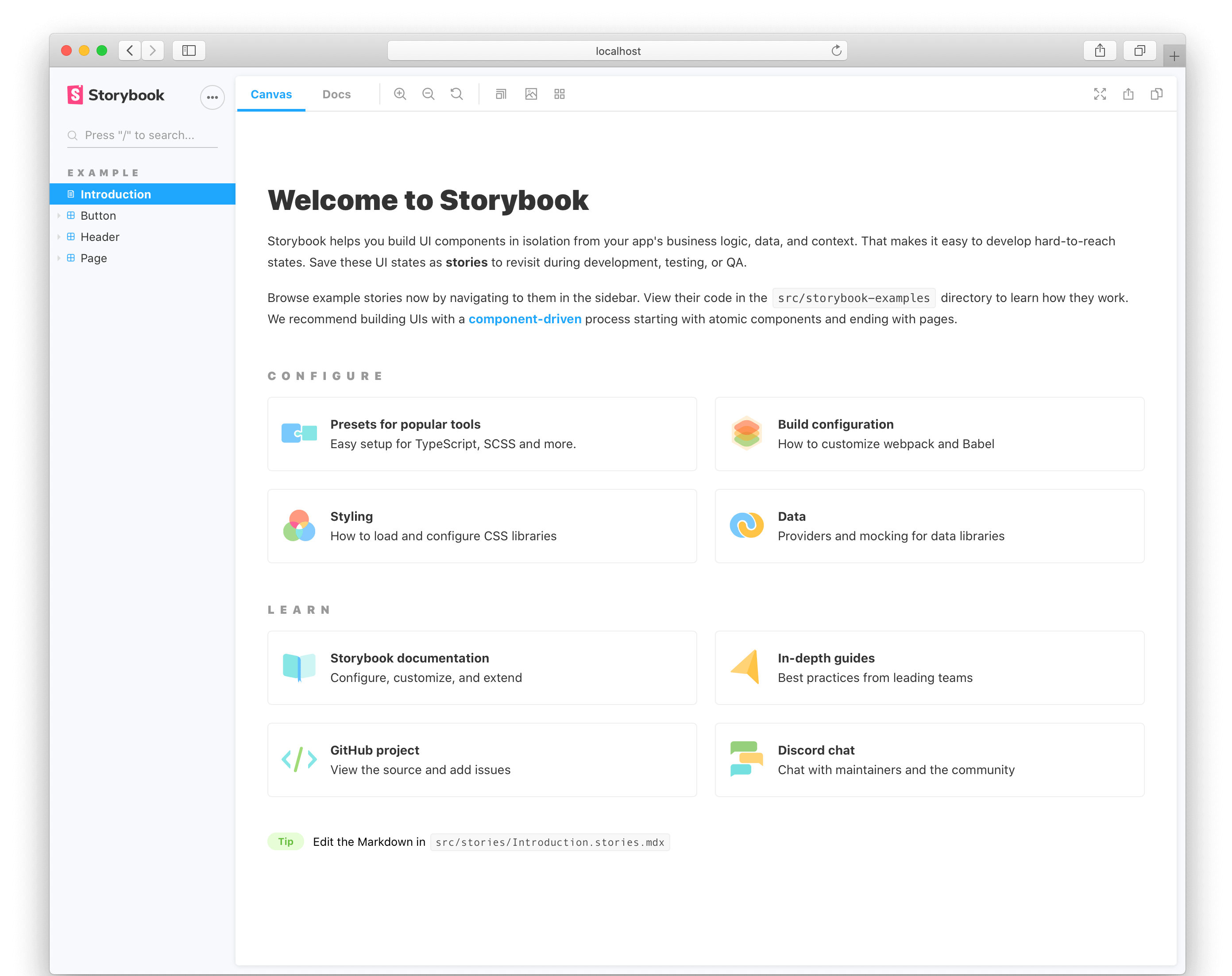
Here are some notable items:
The Storybook recommended in this issue is an open source tool for building UI components and pages individually. It simplifies UI development, testing, and documentation.
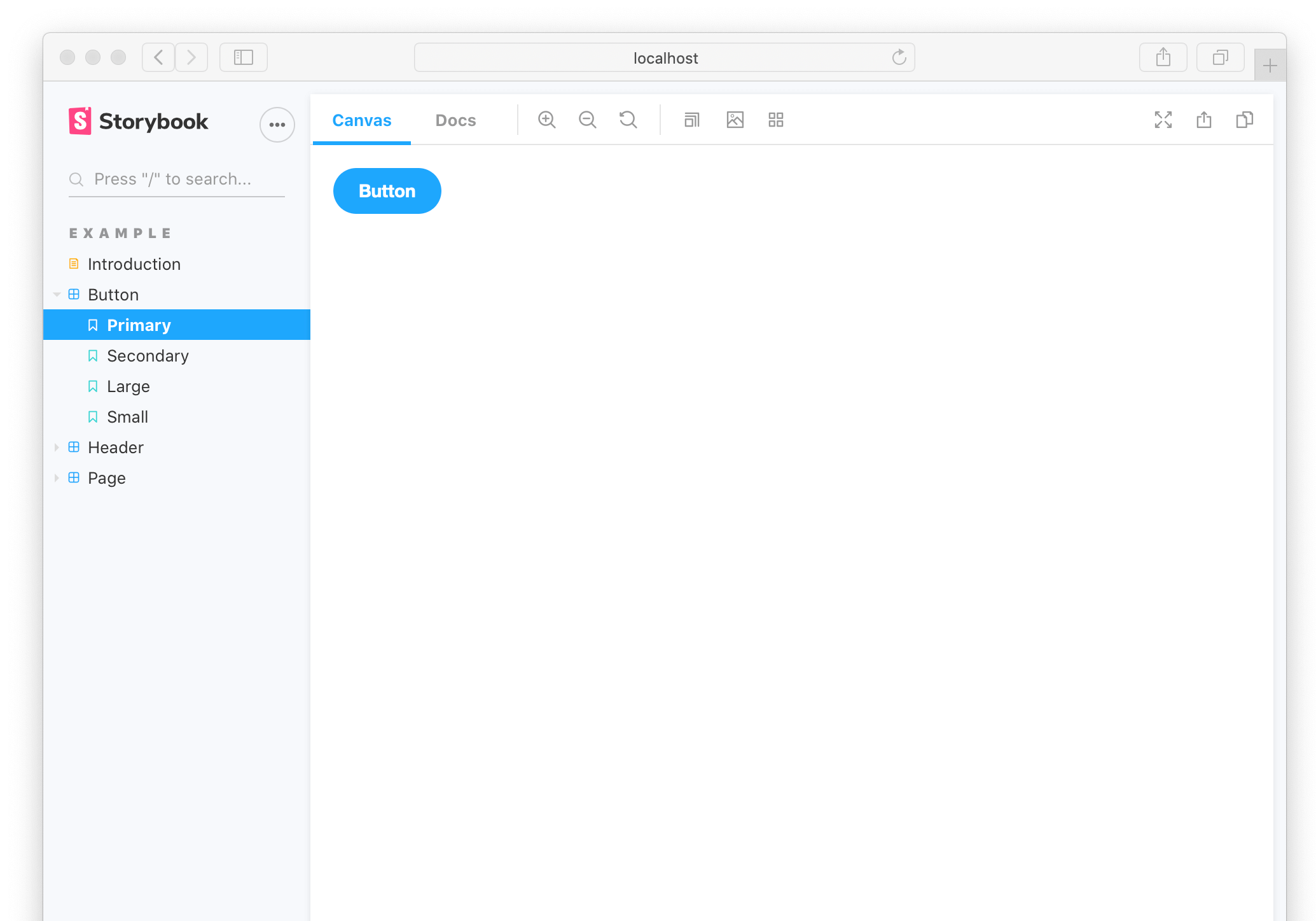
Storybook is a UI development tool. It makes development faster and easier by isolating components. This allows you to work on one component at a time. You can develop the entire UI without having to launch a complex development stack, force some data into the database, or navigate through the application.
Storybook helps you document components for reuse and automatically visually test components to prevent errors. Extend your Storybook with an ecosystem of plug-ins to help you do things like fine-tune responsive layouts or verify accessibility.
Installing Storybook
Install it in a single command using the Storybook CLI. Run it in the root directory of your existing project:
# Add Storybook:
npx sb init
Storybook will look at your project’s dependencies during the installation process and provide you with the best configuration available.
The above command will make the following changes to your local environment:
- Install the required dependencies.
- Sets the scripts needed to run and build the Storybook.
- Add the default Storybook configuration.
- Add some boilerplate stories to help you get started.
According to your framework, first, build your application, and then check that everything works by running it:
# Starts Storybook in development   mode
npm run storybook
It will start the Storybook locally and output the address. Depending on your system configuration, it will automatically open the address in a new browser TAB, and then you will see a welcome screen.
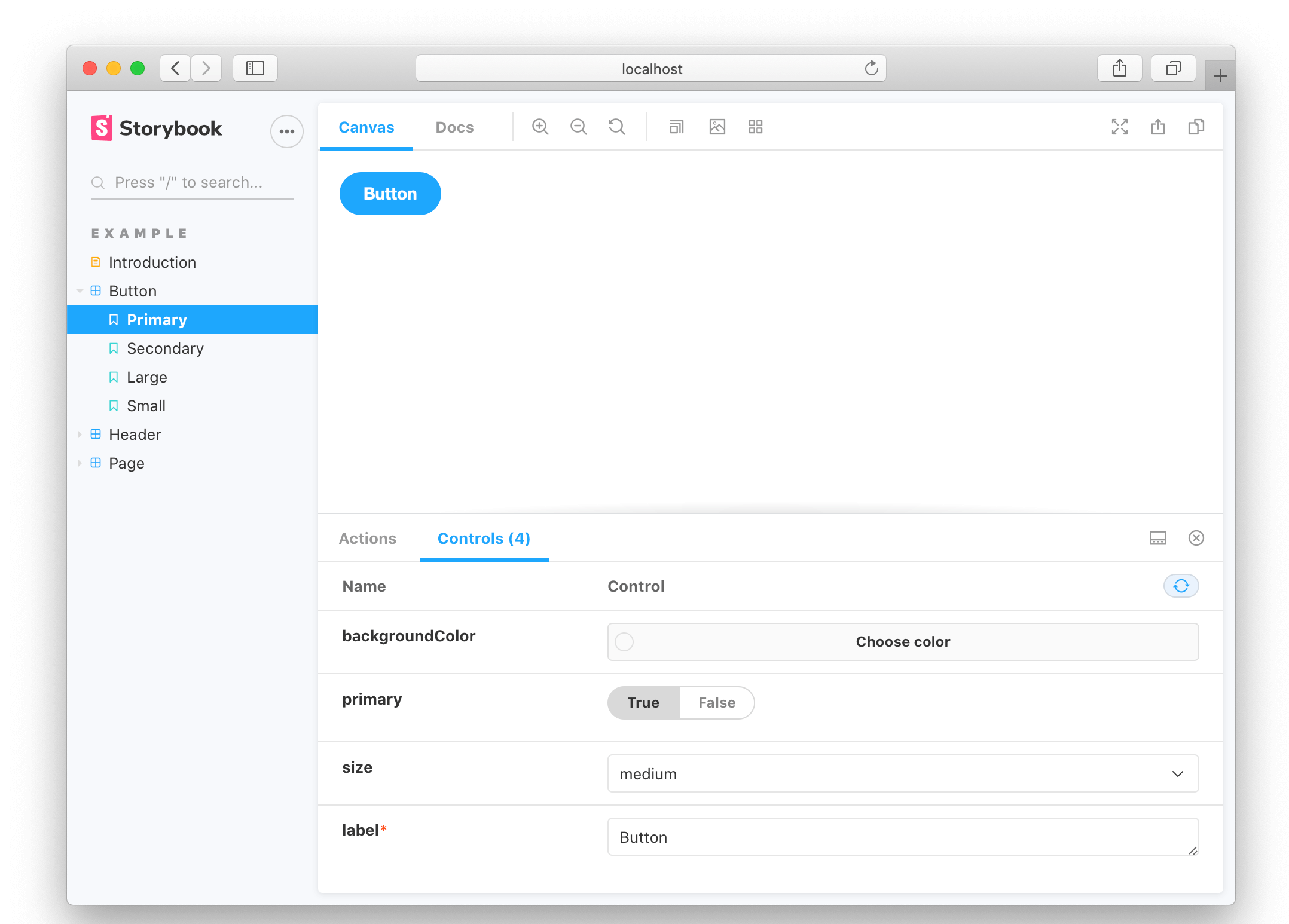
Here are some notable items:
从你的项目中选择一个简单的组件,比如一个 Button,然后编写一个.stories.js, 或一个.stories.mdx文件来配合它。它可能看起来像这样:
// YourComponent.stories.js|jsx

import { YourComponent } from './YourComponent';

// This default export determines where your story goes in the story list
export default {
  /*  The title prop is optional.
  * See https://storybook.js.org/docs/react/configure/overview#configure-story-loading
  * to learn how to generate automatic titles
  */
  title: 'YourComponent',
  component: YourComponent,
};

// We create a “template” of how args map to rendering
const Template = (args) => <YourComponent {...args} />;

export const FirstStory = {
  args: {
    // The args you need here will depend on your component
  },
};
Go to Storybook to see the rendered components, it’s okay if it looks a little unusual right now. Depending on the technology stack, you may also need to configure your Storybook environment further.
< Configure your Storybook project
The main configuration file is main.js. This file controls the behavior of the Storybook server, so you must restart the Storybook process when you make changes. It contains the following:
// .storybook/main.js

module.exports = {
addons: ['@storybook/addon-essentials'],
babel: async (options) =>  ({
// Update your babel configuration here
... options,
}),
framework: '@storybook/react',
stories: ['../src/**/*.stories.@(js|mdx)'],
webpackFinal: async (config, { configType }) =>  {
// Make whatever fine-grained changes you need
// Return the altered config
return config;
},
};
The
configuration main.js file is a default and therefore has a powerful interface, but the key fields in it are:
- stories- a set representing the location of the Story file, relative to main.js.
- addons- List of plug-ins in use.
- webpackFinal- Get used to webpack configuration.
- babel- Get used to babel configuration.
- framework- Framework specific configuration to help with the loading and build process.
Configuration story loading
By default, Storybook will load Story from the project according to glob (pattern matching string),.storybook/main.js where matches all extensions in the project.stories.*. The purpose is that you put the Story file together with the components it records.
•
└── components
├── Button.js
└── Button.stories.js
If you want to use a different naming convention, you can change the glob pico match using the supported syntax.
For example, if you wanted to extract the.md and.js files my-project/src/components from a directory, you could write:
// .storybook/main.js

module.exports = {
stories: ['../my-project/src/components/*.@(js|md)'],
};
How to record components
Storybook gives you tools to extend this basic document with prose and layouts that highlight your components and stories. This allows you to create UI library usage guides, design system sites, and more.
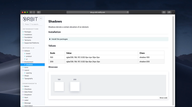
If you include Storybook in your project for the first time, we provide you with a document page, a document template that lists all the stories of the components and associated metadata. It extrapolates metadata values from source code, types, and JSDoc comments. If desired, you can customize this page to create your own custom templates.
If you are already using Storybook and want to update to the latest version, we recommend that you install @
storybook/addon-essentials, include this and other great features in your project.
—END—
Open Source License: MIT License


